A Programmer's Adventure Into UX Design
I started professorbeekums.com with very little knowledge about UX Design. The most obvious solution to that problem is to learn. Yet startups are rife with examples of folks trying to do things themselves when they should have hired a professional. It is human to judge things by their appearance so having poor UX can be a huge blocker to gaining users. For something so critical, it makes sense that I should have hired someone.
The problem is how do you know who to hire? While UX is clearly visual, there are tons of factors UX designers have to take into account that aren’t visually obvious. How can you judge a designers ability to handle those while knowing nothing about them yourself? Hiring a UX designer without understanding even the basics is like trying to hire a software developer without knowing anything about development. The odds of making a very expensive and very poor hire are quite high.
For that reason I wanted to take the first few cracks at creating the UX for professorbeekums.com. I wanted to learn and gain a basic skillset before going out and hiring someone to help me. Here was the first result:
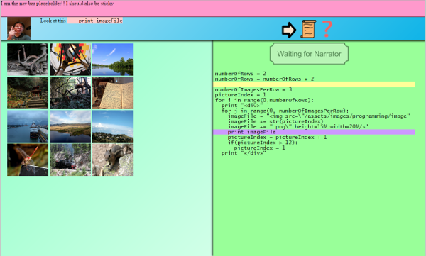
Take a deep breath and give that a good stare. Are you impressed? Probably not.
“But that just looks like a quick prototype! I’m sure you wouldn’t go live like that.”
Sure it was a prototype. But that WAS my first take on what I thought it would look like. Even I thought it looked awful. The biggest issue was the color choices. So I went out and looked up color palettes.
Here is what I sent my friend when I was discussing the UX:
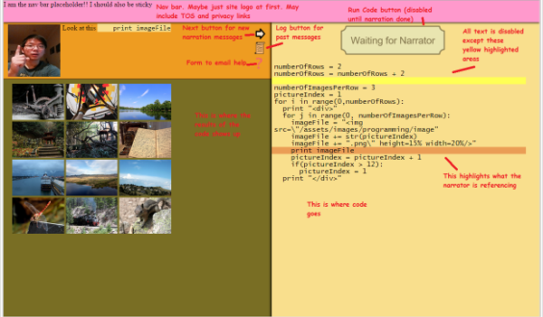
Ignoring the annotations, there’s still a pretty egregious color choice. I literally took the color palette from another website and wondered why mine didn’t look as good.
I got set straight on the need for a single primary color by my friend:
So now I think I’m starting to understand! However, I hate that the vast majority of websites are some combination of blue/black/gray. I wanted to be different. I chose purple. Or at least what I thought was purple:
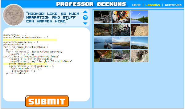
We’ll go back to the color choices later. That isn’t what I fixed next. The next problem is that everything is so constrained. Notice that the screen has a lot going on. The argument could be made that any UI that shows code and output is going to have to be complex. Yet the vast majority of the time, the narrator is just explaining things. The user is only focusing on the tiny text box on the top left or both that tiny text box and the code below it. That tiny text box also constrained the amount of text I could use to explain things. It limited me to text since there wasn’t enough room for meaningful images. I thought about various ways to work around this. I actually had a system of pop-ups that I used to explain things better and with images. While working out the new lesson plan I soon realized that half the lesson would be in a pop-up! What a waste of screen real estate. That is when I decided that all content should just use the entire window. That led me to the slideshow format I use today:
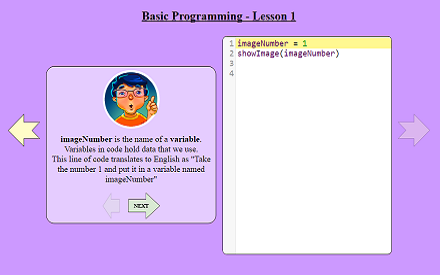 With this better UI came better lessons as well since I was less constrained by what I could put down. The number of images I used to explain things also rose significantly.
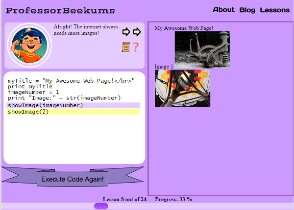
Now back to color. You’ll notice that my color choices are STILL awful. That pinkish purple hurts my eyes and the eyes of my site’s visitors. I was doing all my development with a 9 year old monitor that had weird settings, so this actually DID look decent to me. Once I saw what everyone else saw, I panicked and rushed a new color scheme (taken from someone else’s color palette of course):
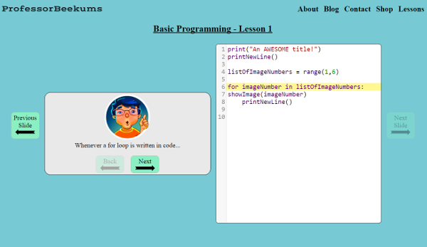
Better! Still a website stuck in the 90s, but better. My problem was I still didn’t fully understand what needed to happen to improve it further. All I knew was that it still didn’t look great. Here is when I started to think about my business card. People loved the way it looked. What if I could emulate that?
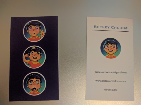
What I noticed was that color was used sparingly, at least in the front. The images of Professor Beekums already add a lot of color so a simple line was enough to enhance the entire card.
My next attempt was to create a similar experience. I started off by tweaking the home page first since it is a lot easier to iterate on static content without complex UI interactions. The idea was to create a navbar and CTA section that had the deep color. Text would need to be white in order to be visible. The rest of the page would look more like my business card: a white background with splashes of color from the portraits and purple lines. Unfortunately, I could not find a shade that I actually liked.

I played around and thought about this new design off and on for a few weeks. In that time I had built a new product on redbubble: the code review mug. I maintained the color of the current website, but I made it a little darker. It looked better darker!
That’s about when I realized that that is the color I should use. I just needed to use that color in the layout I was trying to get purple to work. Here was the result:

The problem is having JUST color as a background. It is a little monotonous. What would be great was if I had some etchings in it! I don’t exactly have the capabilities to make drawings of any decent quality. What I do have is the ability to search! You can search for free images with creative commons: https://search.creativecommons.org/ I found this to be a boon.
I was already using this to find icons for the buttons in the lessons. What I noticed was that icons often came as a package deal like this:
![]()
I picked one that I liked and chose that as my background image. It ended up being a little TOO pronounced though. Fortunately, GIMP is free and can easily reduce the opacity of an image! I ended up reducing it by much more than I thought I would want (0.17). Yet, now I have an ambient background image that adds some variety to the design without being too flashy:
 From there, it was primarily a simple color scheme switch on the lessons. What I needed to figure out now was what colors to use for the secondary buttons. Some quick searching about picking colors brought me to a site explaining the color wheel and color theory.
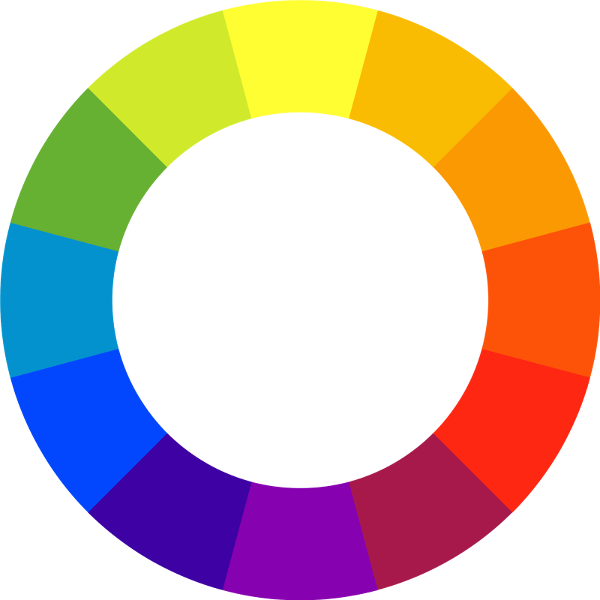
Apparently you want something close to the opposite of the wheel if you sustain yourself with two colors. That meant orange for me:

Whew! That was a very long journey. I made it though! I finally have a website where I am no longer embarrassed about how it looks. Sure it could still use some work. But it is good enough for me to feel comfortable about leaving it like that for a while. I can now spend my time and focus on providing my users more of what they go to professorbeekums.com for: more lessons.
I keep this blog around for posterity, but have since moved on. An explanation can be found here
I still write though and if you'd like to read my more recent work, feel free to subscribe to my substack.


